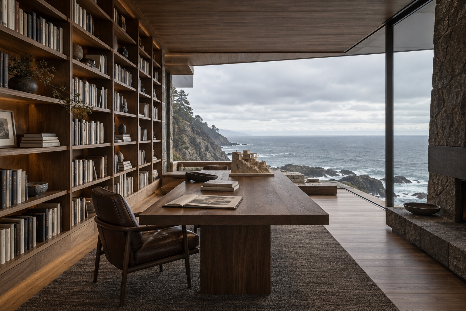

Hamptons is designed for long-form editorial writing, but a good story rarely lives on text alone. This page gathers every type of content card in one place, so you can see how each is styled before you begin publishing. It is also a useful reference when deciding which card best suits a particular moment in a story.
Body text is set in a generous serif with comfortable line spacing. Writers can use bold, italic and inline links, which pick up a quiet underline in the accent colour.
Headings and lists
Second-level headings divide a story into chapters. Third-level headings work well for shorter asides within a section.
A smaller subheading
- Travertine, lime plaster and unlacquered brass
- Oak boards laid in random widths
- Linen, wool and undyed cotton
- Choose a restrained palette.
- Let one material lead.
- Allow surfaces to age.
Images
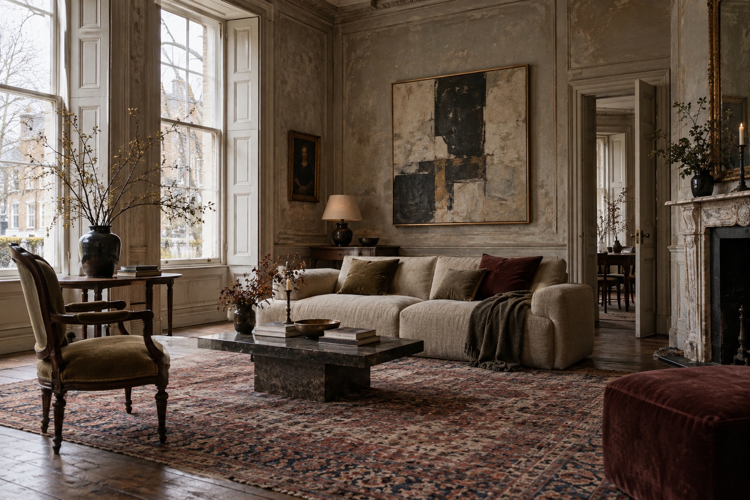
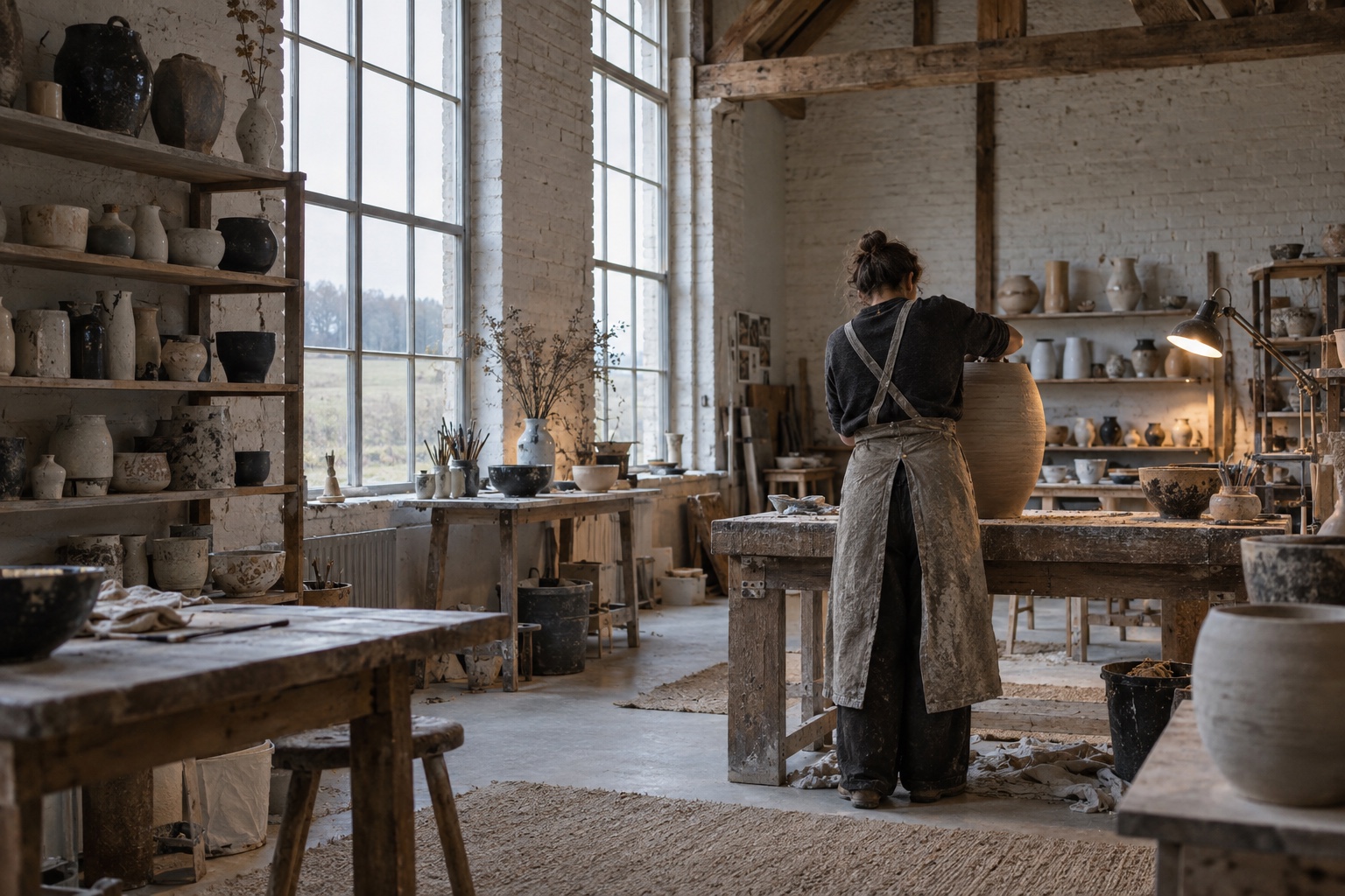
Images can sit within the text column, extend wider than it, or run the full width of the screen. Each supports an optional caption.
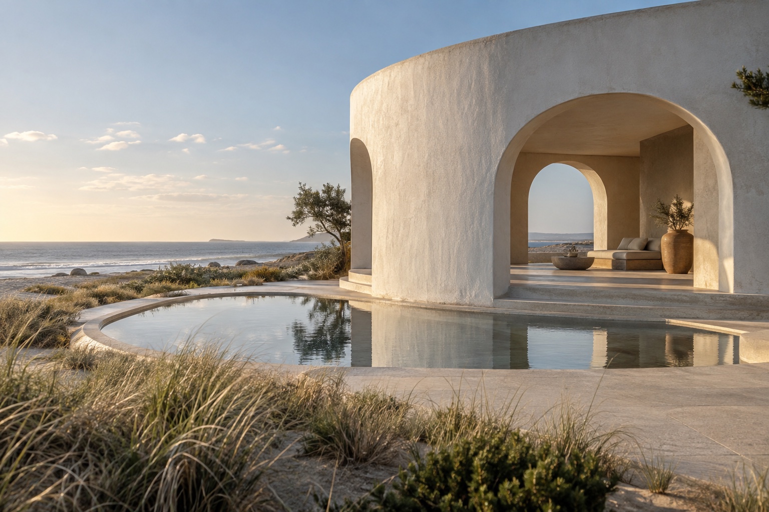
Full-width images are best saved for a single decisive moment in a story, such as the first view of a house or a change of setting.
Galleries
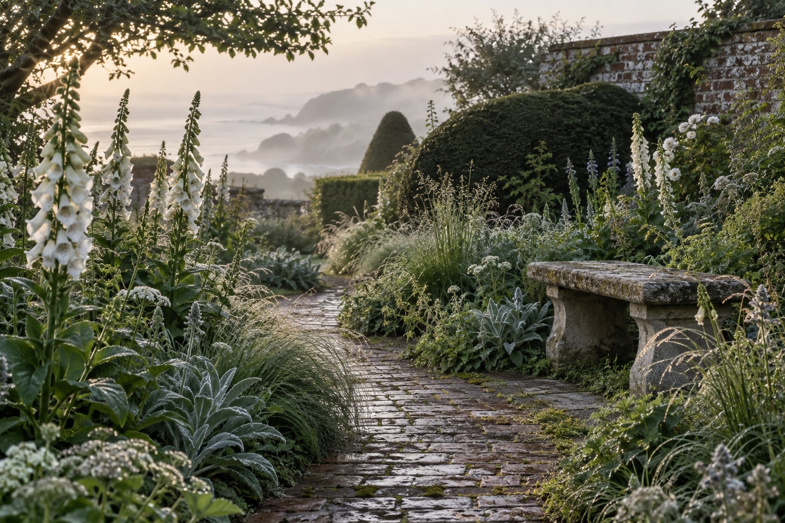
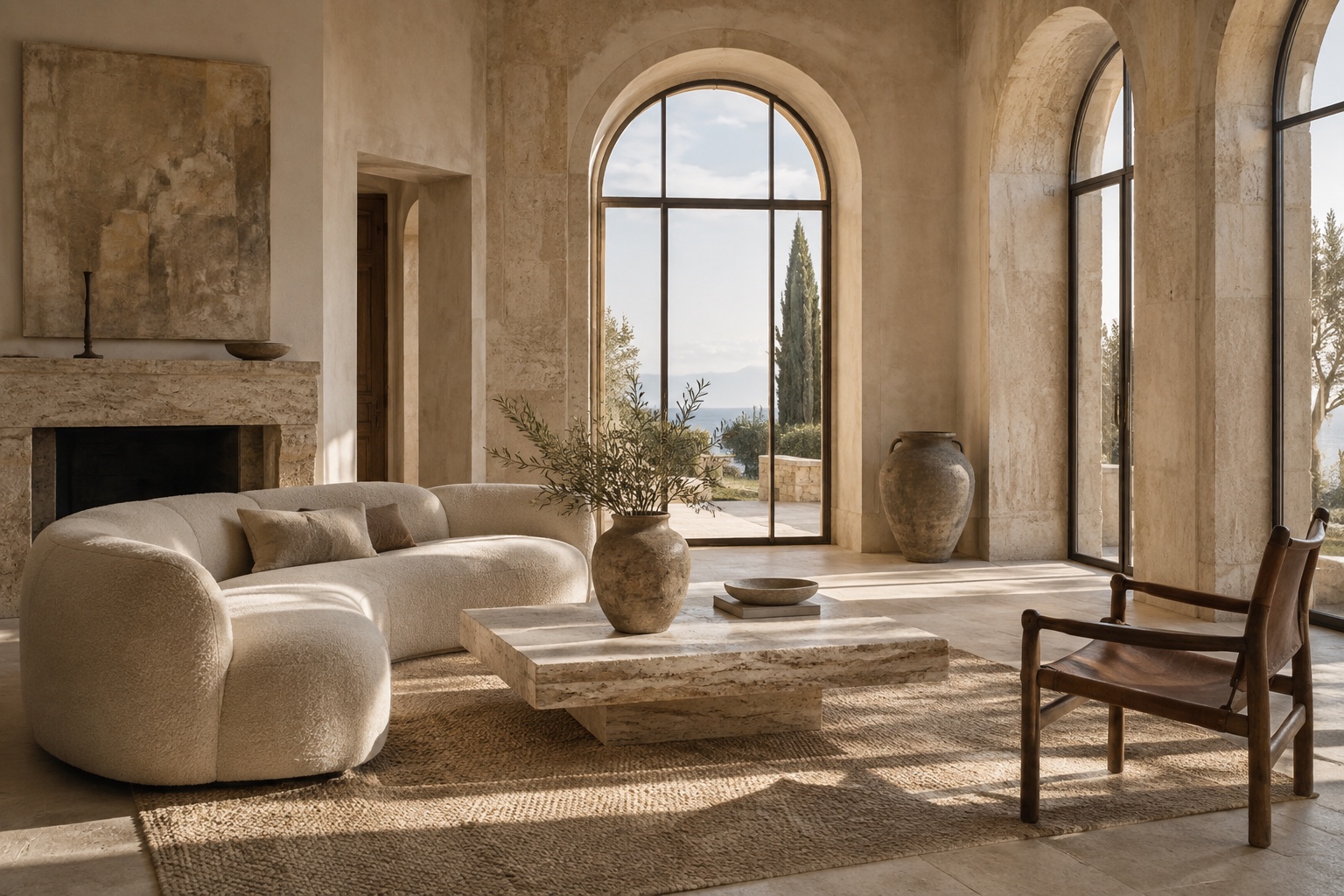
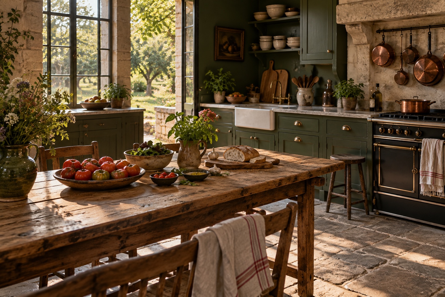
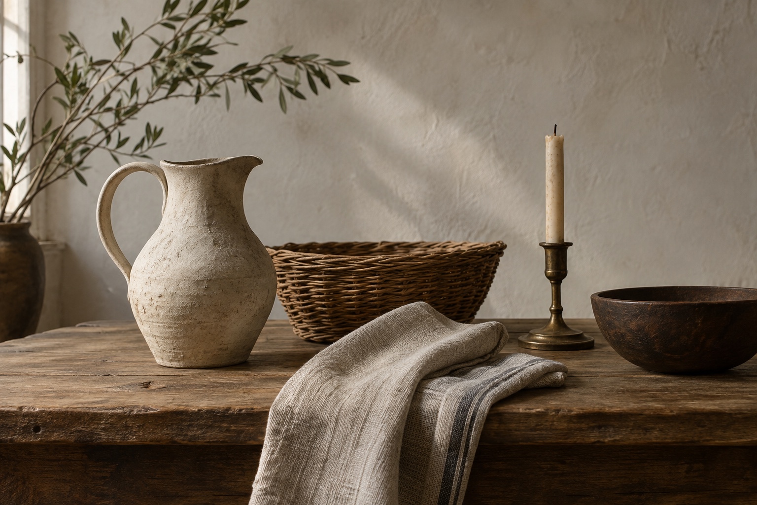
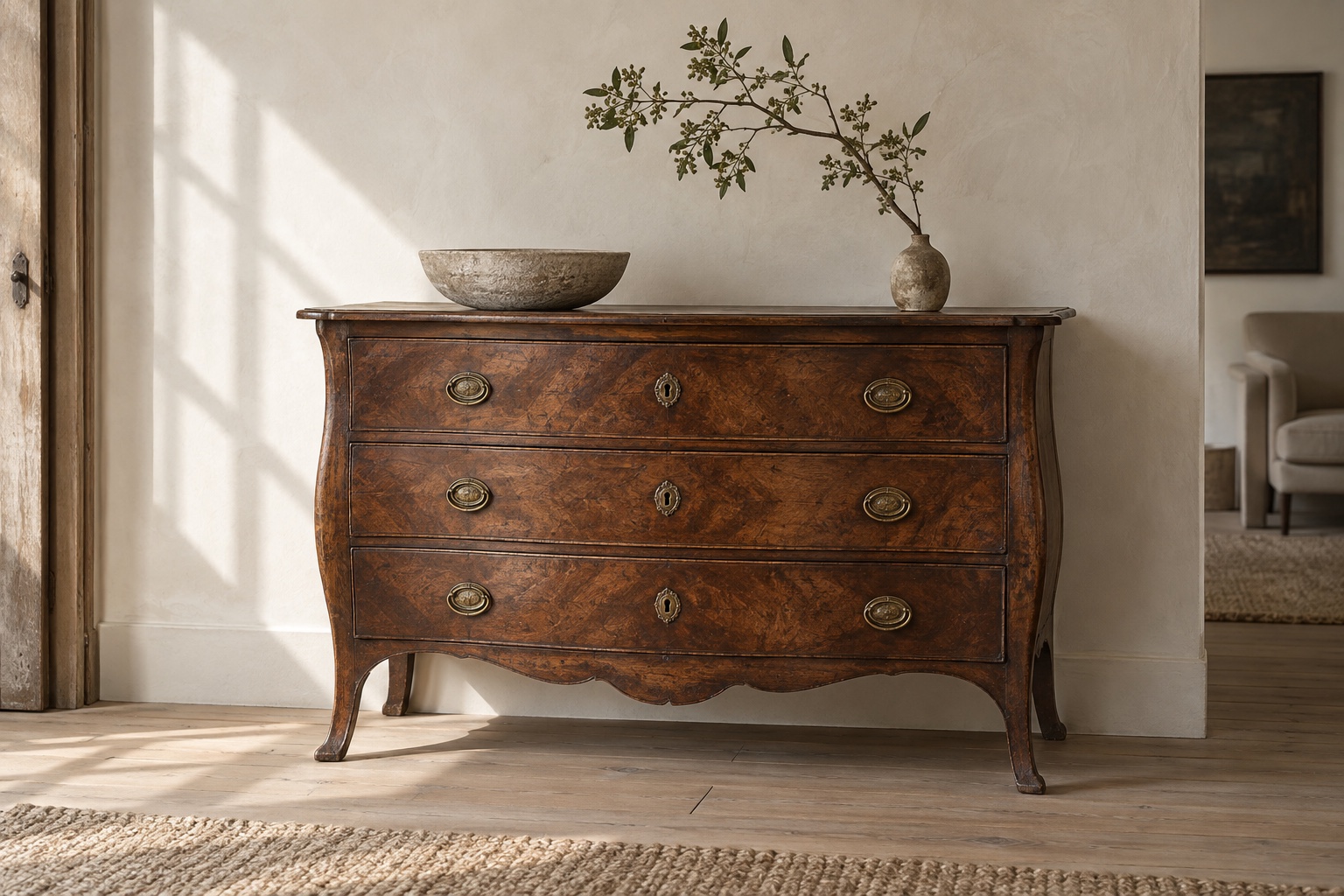
Galleries arrange several images into neat rows. They suit a sequence of rooms, a collection of objects or a walk through a place.
Quotes
A standard quote is set in italic with a fine rule in the accent colour. It suits a line worth pausing on.
The alternative quote style is larger and centred, for the one line a reader should remember.
Callouts, toggles and buttons
What is a toggle card for?
Bookmarks and dividers
A bookmark card turns a link into a preview, which is useful for pointing readers to further reading.

A divider marks a change of scene or a pause in the narrative.
That completes the tour. Everything above is written in Ghost’s editor with no custom code, and adapts from phone to wide desktop screens.
Conversation